It is once again blue and green racecar time
Revisiting Need For Speed Underground 2 nineteen years later, for some reason.
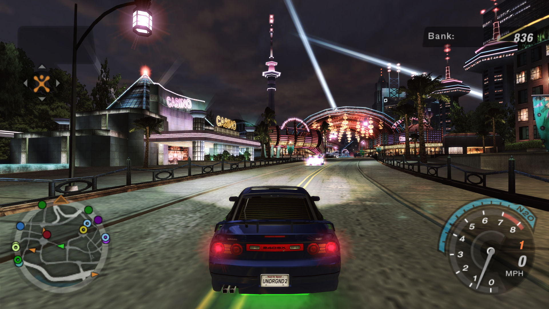
This was originally a Cohost post about the current racing game I'm playing, but it got long and elaborate enough to be a proper blog post.
After some friends cracked jokes in an unrelated hangout about how goofy undercarriage RGB lighting is, I was inspired to grab retail CD images for Need For Speed Underground 2 off an abandonware site, and apply the 1.2 official patch, a no-CD-check patch (delightfully retro!), ThirteenAG's resolution/controller fix, and another controller fix that adds some quality of life features back from the console versions, like using the right stick to rotate the car in menus.
This is, if you can believe it, one of the easier processes I've gone through to make a vintage Windows game work to my standards on this computer! Perennial favorite occult person shooter Clive Barker's Undying required maybe three times this amount of effort, generously estimating.
You might ask me why I'd bother with all this trouble at all for a Need for Speed game, and that's perfectly valid given that with arguably no exception it's the most iconically boring/generic racing game franchise, full stop. The short answer is I have... something akin to nostalgia but not quite that for this game in particular. I guess literally just positive memories? Which is maybe the normal middling degree of what turns into nostalgia.
I was never into the Fast & Furious movies until they defocused street racing and shifted into heist action with Fast Five, so I never had any specific interest in street racing as an aesthetic during its cultural peak. I got the original Need for Speed Underground from my dad as a Christmas thing, one of those gifts parents do where they gamble on a recent big game release being of interest. It was a modestly successful gamble, and I got enough fun out of it that he also got me 2 the next year.
Underground 2 was, you may or may not recall, the NFS series' first foray into an open world. (Remember when big-budget games were allowed to not be open worlds? Even Halo is a fuckin open world now.) Underground 1 ripped the glamorously decorated tuner car aesthetic from The Fast and the Furious because that was so in right now, and then 2 combined that with ripping off Grand Theft Auto. It isn't such a success from a design standpoint that every Need For Speed game since needed to be open world, but it probably sold real well, and it is IMHO enough of a success that it was emphatically worth setting up and revisiting.
The two big standout things so far:
This game is so colorful! There is barely any white light anywhere, it's all tinged blue or pink or yellow or green and the city is fucking beautiful and stylish and vibrant. Different districts have different aesthetic vibes but feel like a cohesive single city. Buildings are architecturally interesting and not generic Chicago/LA/NYC glass-and-steel or brick-and-plaster cubes. Saturated-bright color coded spotlights hint at where different kinds of useful building are. It's a genuine tragedy that they immediately dumped this great art direction for Most Wanted's color filter of unyielding piss a year later.
There is so much in-game advertising! There are in-game Burger Kings and Best Buys that have zero mechanical purpose and are just weird little advertisement sculptures, like Tower Records and KFC in the original Crazy Taxi. There are also billboards advertising some odd choices of real product: Old Spice, a brand of shaving product (unclear if gel or razors) called Edge, and a specific sub-brand of Campbell's soup that claims to be "on the go" in some way.
More pervasive on the ad front is the Cingular branding on the in-game cell phone service, through which you receive all your messages about racing and racecars. The Cingular logo is visible on the HUD at all times in the open world, and the voice actors awkwardly say "SMS" instead of text/texting, because that is the officially sanctioned marketing term.
In the end, though, the advertising is simultaneously awkwardly disruptive and still sort of charming to me? Advertising real current products to coerce me into buying them while I'm trying to drive racecars would be deeply obnoxious, and this game at the time of release would have been deeply obnoxious in this way. But now? Many of these brands no longer exist, including the constantly-present cell phone carrier. Instead of feeling like I'm being sold to, now it just feels like a quaint little time capsule of a bygone era.
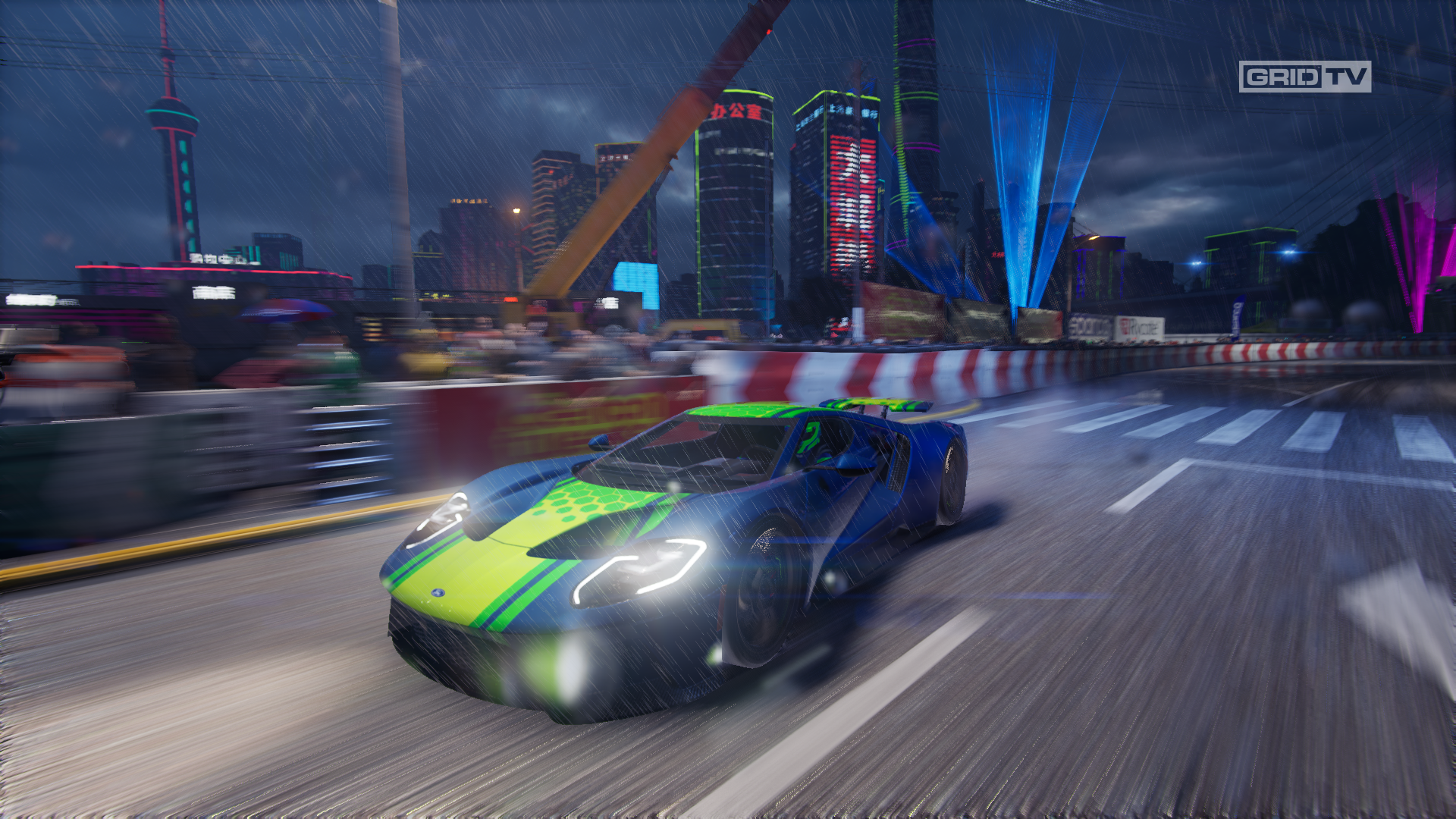
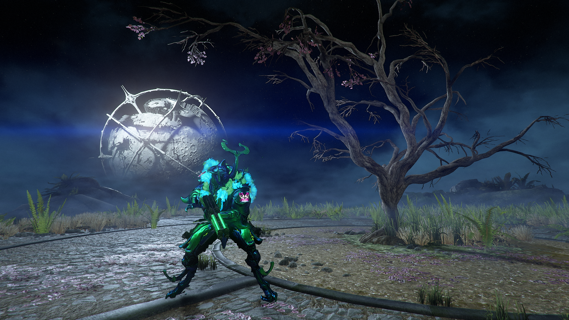
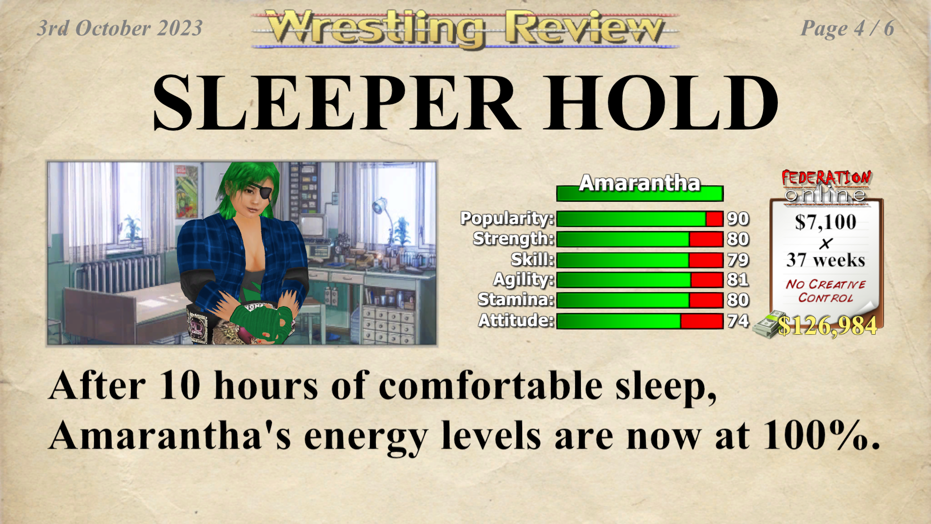
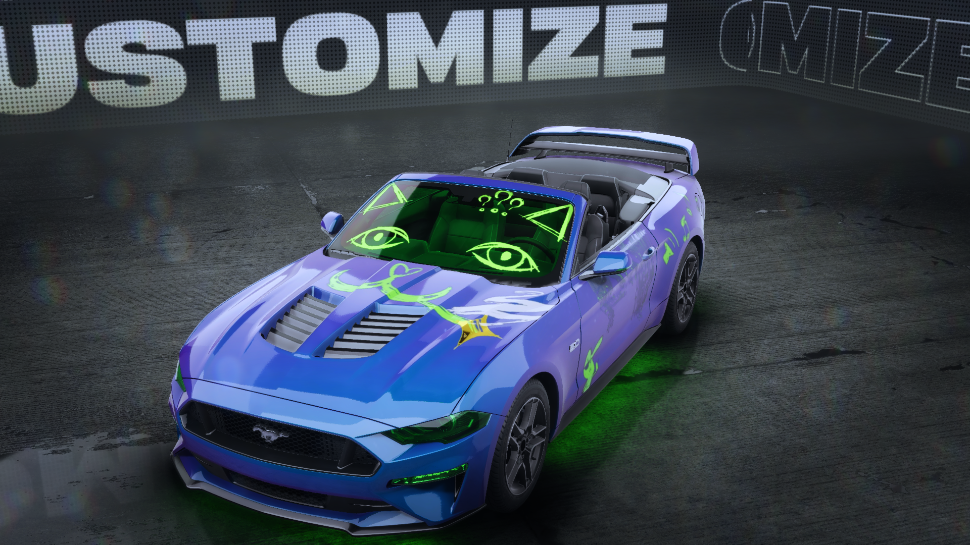
The whole game, really, is a quaint little time capsule of a bygone era! The main thing I remembered before I revisited this was that the car customization in this was where I figured out the blue-with-green-trim/highlights color scheme that has been my signature in every game with customization of any kind in the decades since.
I barely mentioned the gameplay, and that's because it's Fine, it Does The Job, and if you don't already know whether you're interested in PS2-era simcade-style racing games, I have to say they probably aren't great enough to be worth trying to sell you on anyway.
In lieu of ruminating on how the car handling feels, enjoy a short gallery of customized game stuff from the past few months that uses the color scheme I nailed down in this game all those years ago.
